MONKEY TURNKEY
THE SMART FULL-SERVICE PARTNER
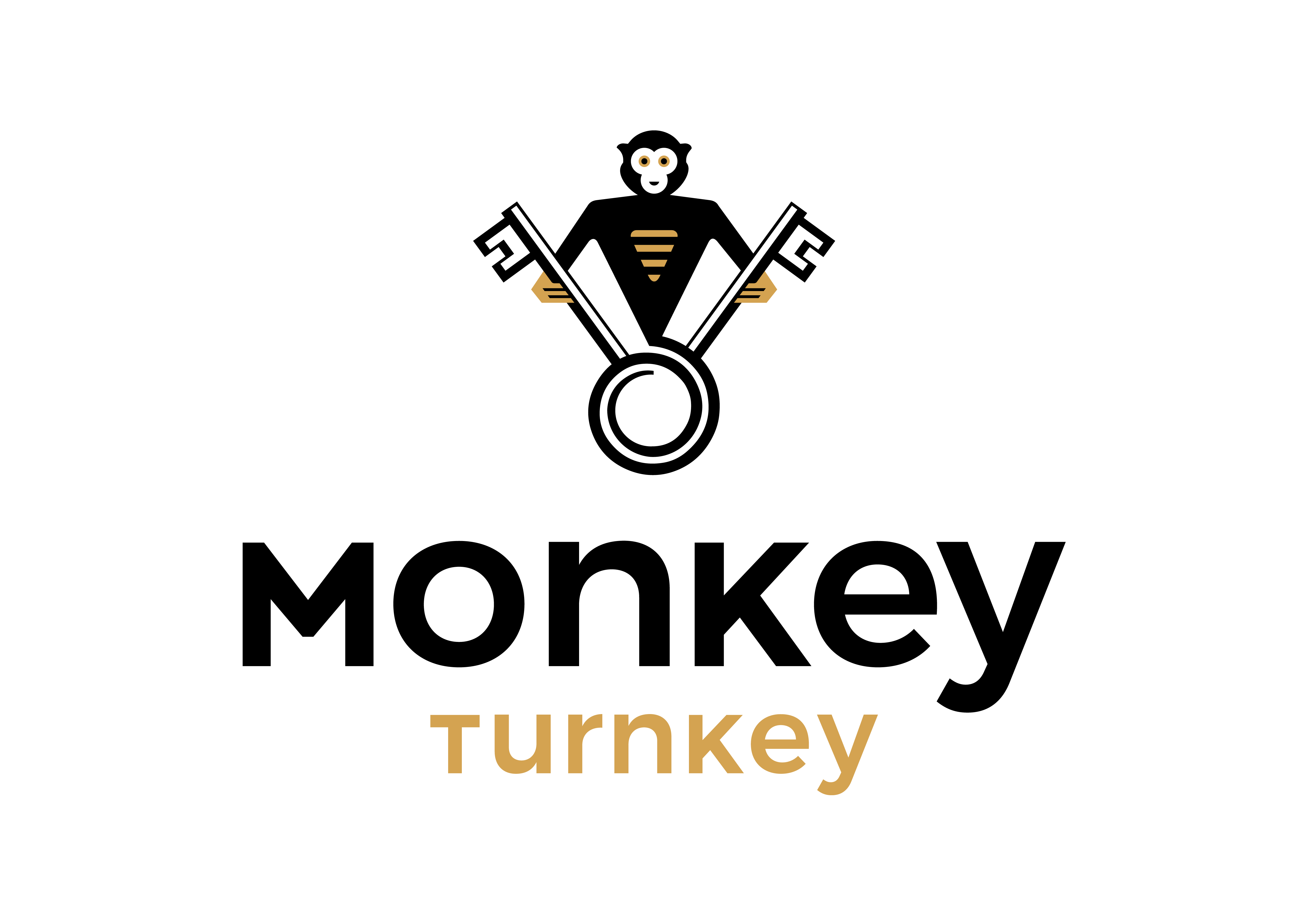
The idea behind the graphic concept was to show the agility of a business with the image of a monkey at the lead of a ship, hands on the helm, maneuvering the boat.
The icon refers to the firm’s know-how with quality details.
The all caps typo is efficient yet elegant, it shows modernity and elegance with the spacing between the letters.
The brown-y color reminds that of gold and the black is statutory.


