Etude House_Honey Cera
Full of cute and accessible pink-colored products
Full of cute and accessible pink-colored products, the doll-house styled boutique Etude House caters to a young clientele. How can we offer a new and significantly less “kawaii” centered product range to the same consumers?
The challenge was taken on by centdegrés, charged with inventing the identity of the Korean brand’s new skincare line, Honey Cera. Made from honey and ceramides, the line is aimed at adolescents and young women in search of functional and intelligent products.
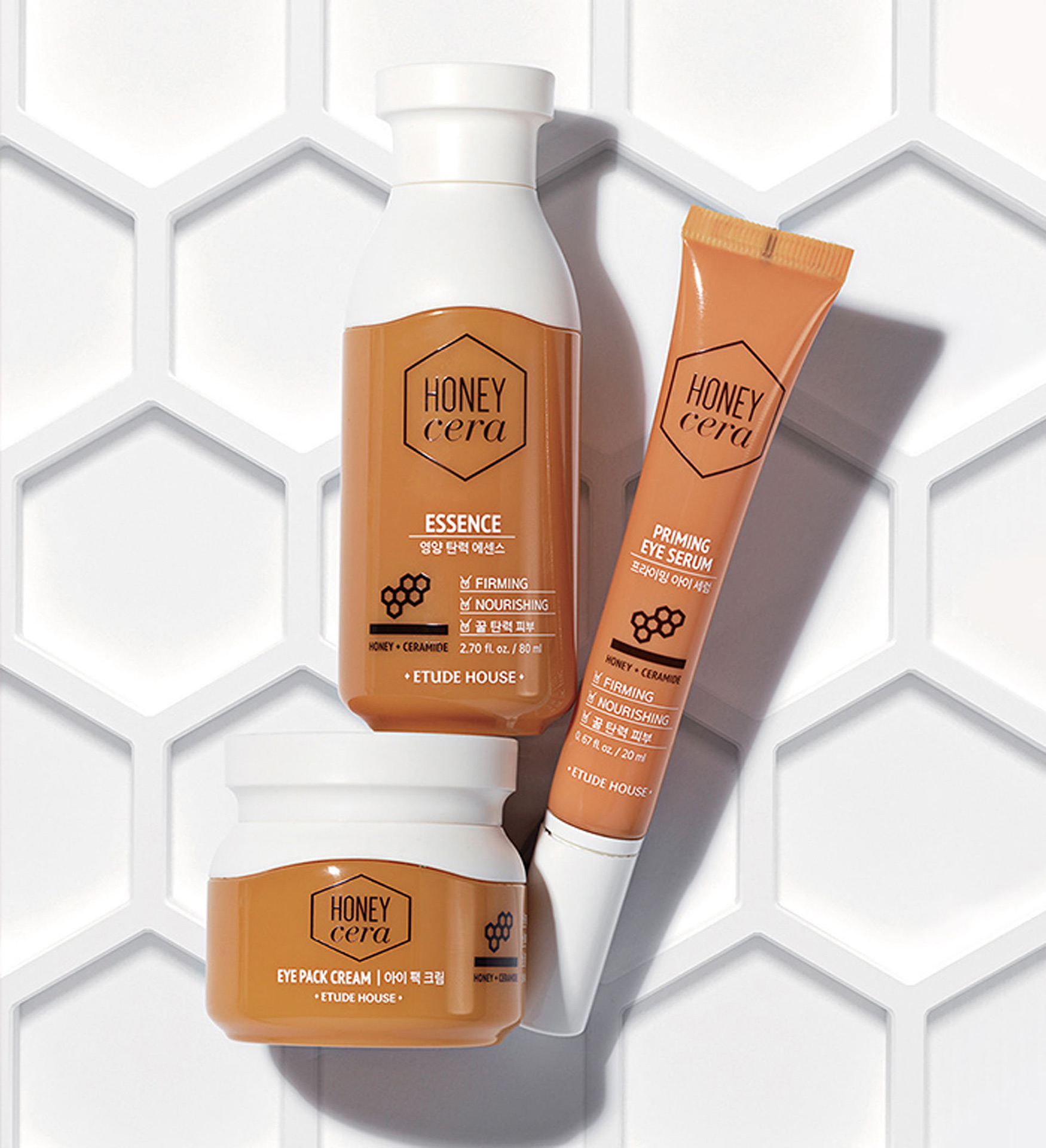
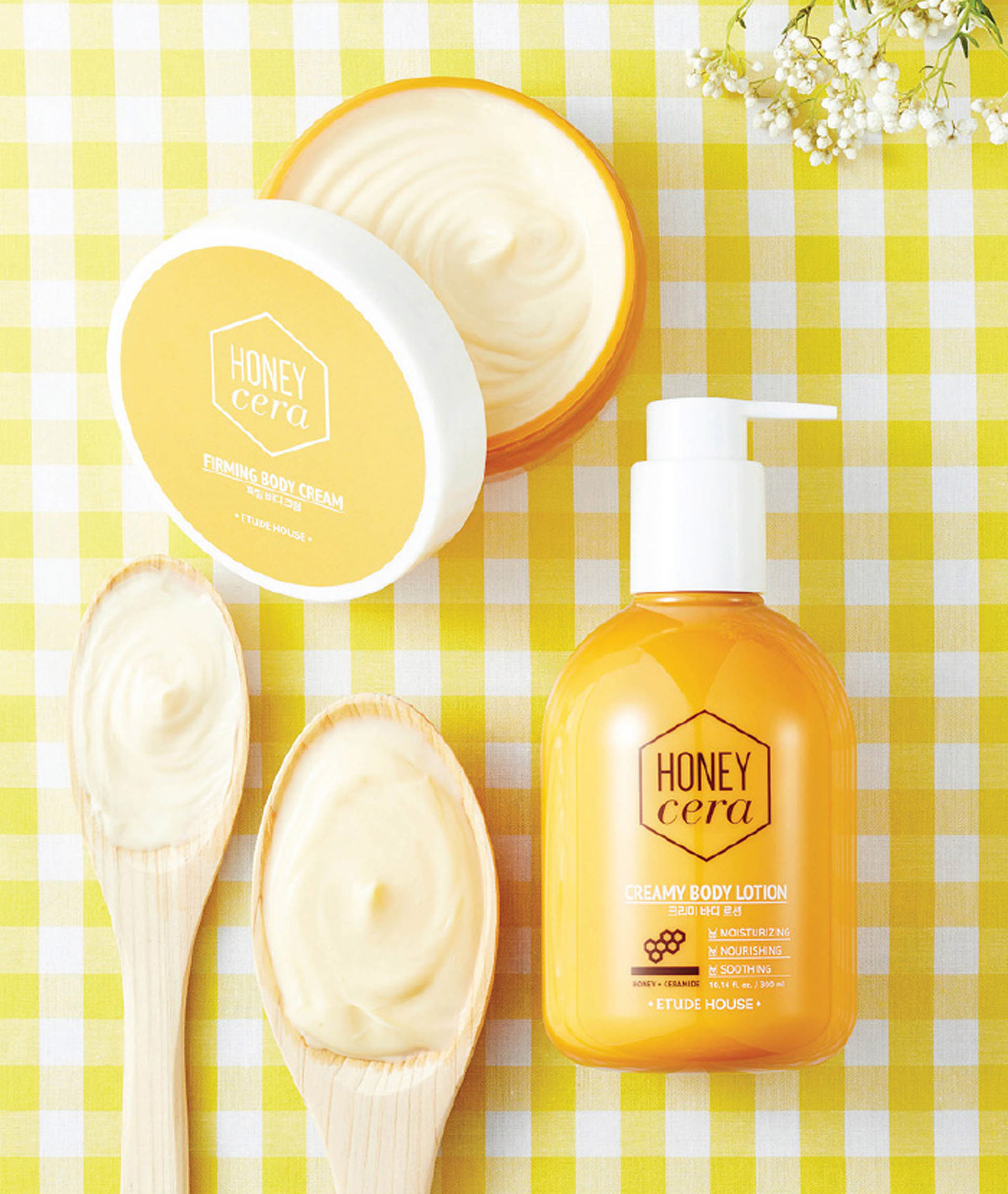
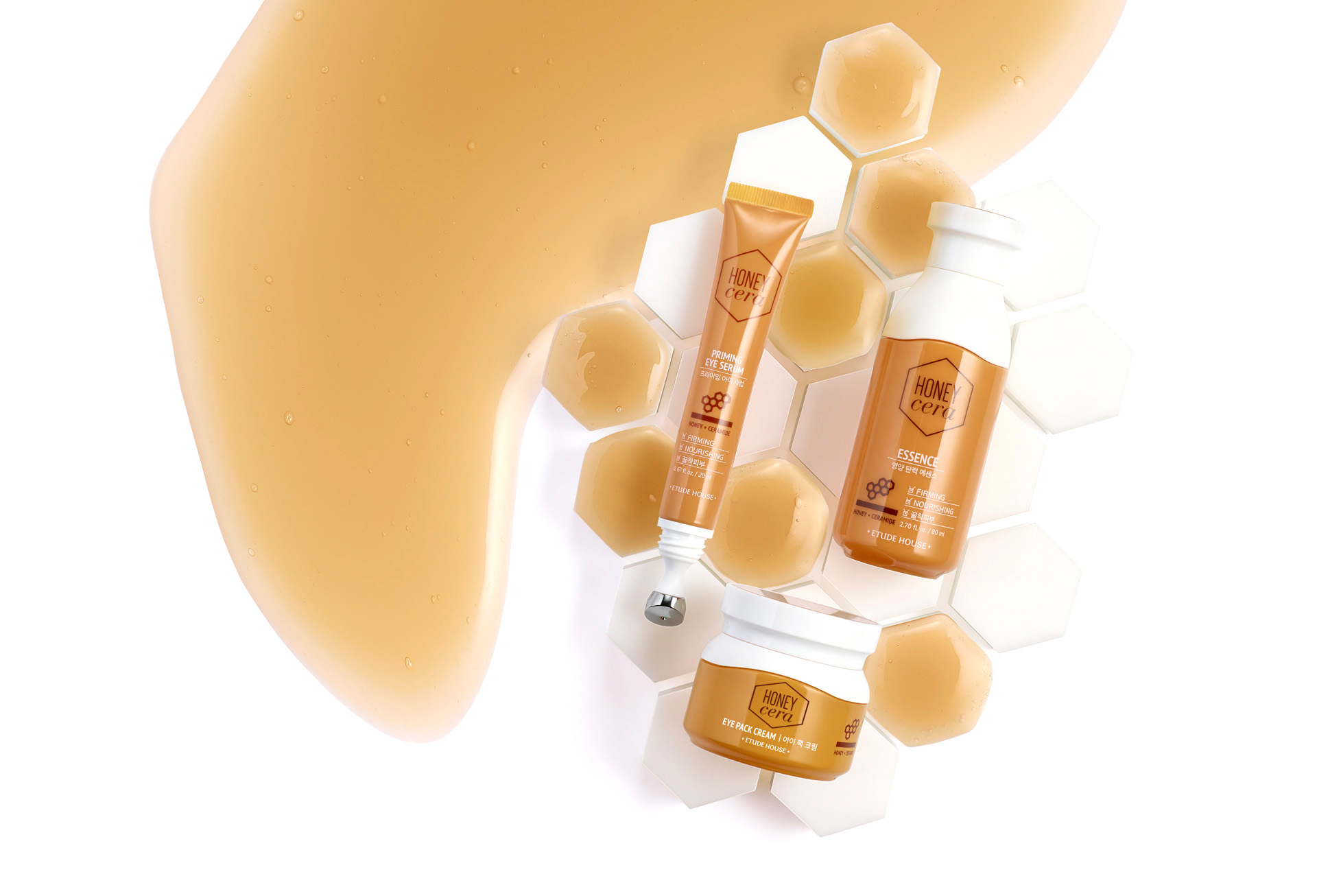
To create the graphic foundations and visual aspects of Honey Cera, centdegrés combined the natural softness of honey with the technical influence of the ceramides. The agency paired honeycombs to functional laboratory pictograms and the warm blond color of honey to crisp and clinical white to create a product both serious and pretty. The packaging designed by centdegrés in white and honey exhibit both the technical and natural aspects of the product. The design replicates the round and compact visual codes of the brand as well as the healthy purity of bottled water and the shape of traditional remedy containers.
The result preserves the brand’s DNA while accompanying and introducing young clients of Etude House to a new story and experience, just as soft and efficient but more advanced.
